
Recent Work
Web Design

Yazar Lab
I designed and built this website for a scientific researcher specializing in psychedelics and pharmaceutical research who has transitioned into consulting. The goal was to create a credible, modern web presence that reflects both her deep scientific expertise and her role as a strategic partner for companies working in this emerging field. The site balances clarity and professionalism with approachability, making complex subject matter easy to navigate while supporting her consulting services and long-term growth.
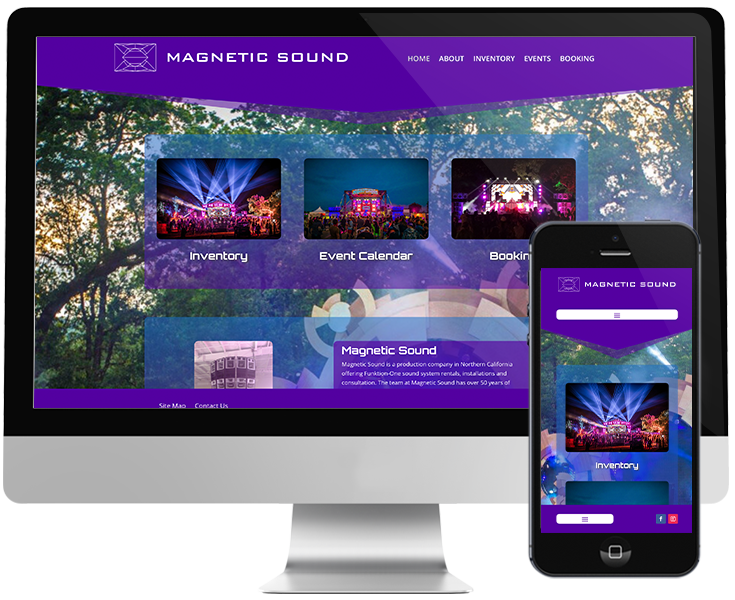
Magnetic Sound
I designed and built this website for Magnetic Sound, a sound reinforcement company supporting music events across the West Coast and beyond. Specializing in Funktion-One sound systems, their work sits at the intersection of technical precision and immersive, high-quality sound. The goal of the site was to reflect that balance—combining a strong visual presence with clear structure and usability—while positioning Magnetic Sound as a trusted partner for events that take sound seriously.
Graphic Design
Logo for Yazar Lab
This logo was a collaborative process built from the client’s original concept. She came in with a strong typographic direction created with AI, which I refined and carefully cleaned up for professional use. I also integrated a neuron motif into the design, adding a subtle visual layer that reflects the scientific focus of her work while keeping the overall mark clean, modern, and versatile.
Logo for Raindance Presents
This logo was created for Raindance Presents, an event company based in Santa Cruz, California. The core mark is a raindrop, layered with the silhouette of a redwood tree within it—bringing together movement, nature, and place. Inspired by the coastal environment where redwoods thrive, the logo reflects the company’s roots while offering a strong, memorable visual identity. I had a lot of fun creating this one many moons ago.
Logo for Canna Releaf
This logo was designed for Canna Releaf, a cannabis skincare company creating high-quality topical salves and bath bombs. Because the logo needed to work on small packaging and labels, the focus was on simplicity and clarity. A hand-drawn, artsy cannabis leaf paired with a soft, script-style font creates a mark that feels approachable, natural, and easy to recognize at any scale.